Posts

Showing posts from October, 2022

Pinterest Articles

https://flipboard.com/following/topics . https://www.pinterest.com/jrwylie810/article-links/

Presentation Links

Website LinkedIn Facebook Instagram Tiktok

Black Mirror Reflections & Research

What does it mean? Black Mirror is a rating system. It allows people to be rated 24/7 on what they do, how they do it, how they act or talk, etc. Every action they take can be graded by others. What will you think or do differently? If this would actually happen, I don't think I would change much. To be completely honest, I try to portray myself in a favorable manner as often as possible. Maybe making sure I watch the way I talk to people, so I don't come off as too sarcastic, or I make sure I set alarms for class, so I can get there on time 😂 Other than that, I have always tried to be responsible and sensible while in public, or I at least try my best. How do you feel about this information in relation to your current project of Personal Branding your Social Media? It is certainly an interesting discussion right now. It makes me very mindful of what I'm putting on my social media bio or page, as I wouldn't want to get a bad grade for an inappropriate meme or someth...
Social Medias

LinkedIn Facebook Instagram Tiktok

Writing Your Social Media Profile Bio(s)

The process for LinkedIn was pretty straightforward. I wanted to get the most relevant information on the page without any fluff. I used template one as the baseline and gathered all the information I felt was necessary. The Facebook bio was a bit more difficult because it seemed like it was geared toward a more organizational or company-style bio. I shrunk my Instagram bio, removed the content themes, and then laid out the information in a relevant way. For my Instagram bio, I really liked the look of the emoji template. I felt as if it had my general theme of using relevant information; however, it dressed it up in a fun way. I use my Instagram to share memes, so I didn't want my Instagram to look too serious; however, the emoji template was perfect. The last bio I did was for my Tiktok. With only 80 characters, I had to cut a lot of the emojis out and really just gave the bare bones of a bio. I wish I could have been a tiny bit more in-depth on who I was or what I'm about, b...

Research Personal Sites

  Home/Landing Page: I really liked the look of a slightly dramatic, black and white picture as the first thing when you open the page. I think it adds an eye-catching factor without being too over-bearing. I would prefer to have some sort of slogan or motto on the black and white image as well. Other than that I dont think i want anything else on the home page that is too distracting. Ill probably just have the links to the other sections of the website. I think i will have a small bio about myself and a link to my resume. About Me/Bio Info: I want this to be as straightforward and professional as possible. I think if i have a full page on this i'm going to break down my bio into a couple different portions that talk about growing up, jobs i have worked, hobbies and similar fields that go a bit more indepth. Resume:  Resume.docx , I would like this to transition from the about me to my resume. One of the websites had a fantastic transition from their bio to their resume and I...

Ad Design Analysis and Cover ReDesign Project

Image
Ad: Cover:

Ad Design Analysis and Cover ReDesign Project

Image
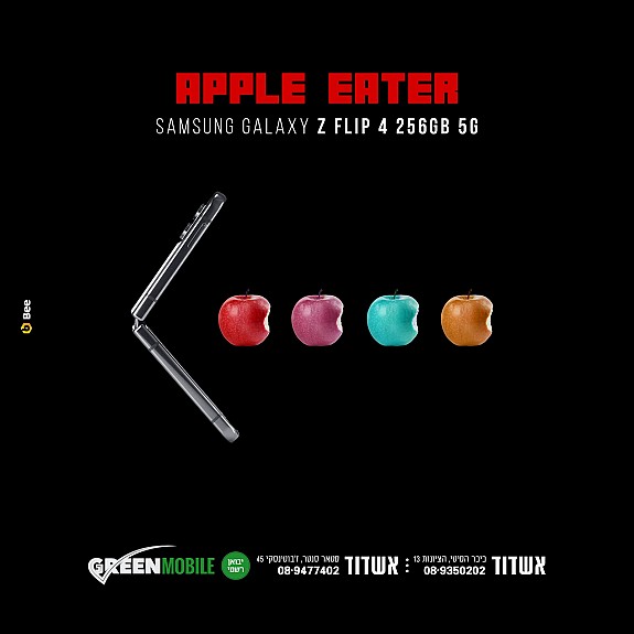
 A couple different design principles I noticed right off the bat was the contrast, proximity, and alignment. I also noticed the perspective, lighting, and fill the frame being used here as well. And of course who can miss the symbolism in this image? For contrast it is pretty obvious there is some difference between the colors of the apples, also the color of the apple compared to the phone. I wasn't a big fan of the proximity, it felt like a lot of the image was made up of logo and info, however that could be intentional due to nature of the black background. The alignment is sort of obvious here as well, the apples and phone are perfectly in the middle of the image. The perspective was interesting because the apples and phone immediately pull you into the center of the picture, the colorful apples against the dark background help them catch your eye. I also think it's important to note the lightning in this image. As far as I can tell there is no natural light here, however ...

My New photos

Image
I took this picture yesterday at Limestone University. One of the compositional principles I think this demonstrates is the Rule of Thirds and Leading Lines. I took this picture earlier today at my house. I struggled at first to figure out what compositional principles this included; however, I decided on the Rule of Thirds and Diagonal Lines. I took this picture earlier today as I was leaving my house. I think Fill the Frame would be the most applicable principle here. I took this picture yesterday as I was walking across Limestone University. Diagonal lines, Figure to Ground, and even some Leading Lines can be found in this image.  

Personal Website

 https://jrwylie810.wixsite.com/jacobwylieportfolio