Ad Design Analysis and Cover ReDesign Project
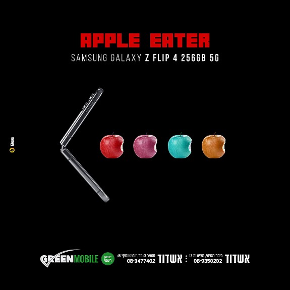
A couple different design principles I noticed right off the bat was the contrast, proximity, and alignment. I also noticed the perspective, lighting, and fill the frame being used here as well. And of course who can miss the symbolism in this image?
For contrast it is pretty obvious there is some difference between the colors of the apples, also the color of the apple compared to the phone. I wasn't a big fan of the proximity, it felt like a lot of the image was made up of logo and info, however that could be intentional due to nature of the black background. The alignment is sort of obvious here as well, the apples and phone are perfectly in the middle of the image.
The perspective was interesting because the apples and phone immediately pull you into the center of the picture, the colorful apples against the dark background help them catch your eye. I also think it's important to note the lightning in this image. As far as I can tell there is no natural light here, however the apples and phone all still have great lighting behind them that doesn't distract the viewer. Fill the frame is sort of obvious here as this image is solely what the creator would want in the image. The symbolism is a key aspect of the image as right off the bat we recognize it, its Pac-man!!

Comments
Post a Comment